How I turned World Cupdata into posters
The World Cup is a melting pot. It mixes geopolitics, underdogs, national identity, tactical obsession, and those brief moments of brilliance that make everyone watching feel the same thing at once. It has everything a good story needs, which is probably why it keeps pulling me back.
For the past four World Cups — 2018, 2019, 2022, and 2023 — I've been trying to turn match data into posters. Each edition became a different visual system, another attempt to challenge the conventions of infographics and make art with data. Something you feel and perceive before reading it.
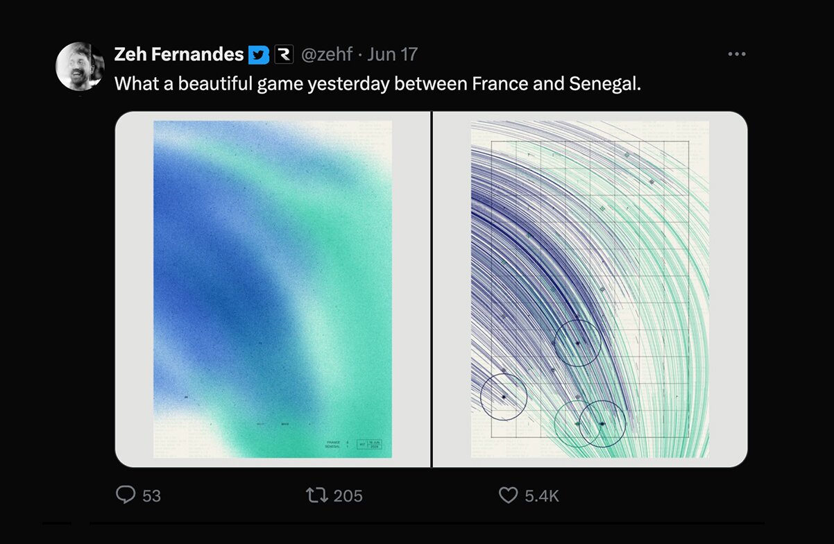
For 2026 I wanted to do something different: make an organic, painting-like poster of two teams pushing against each other, blurring into the lines.
After it blew up on Twitter, I decided to write a breakdown of how these posters are made.
Tooling and data
Everything starts with the data. No poster exists without it. Before the brush strokes, before the color.
All the data comes from the official FIFA website¹. So I wrote a Node script that downloads the aggregate match stats and the event timeline: goals, fouls, cards, attempts.
¹ The data isn't exactly public-facing, but if you dig into the network tab of your browser you can find the endpoints they use.
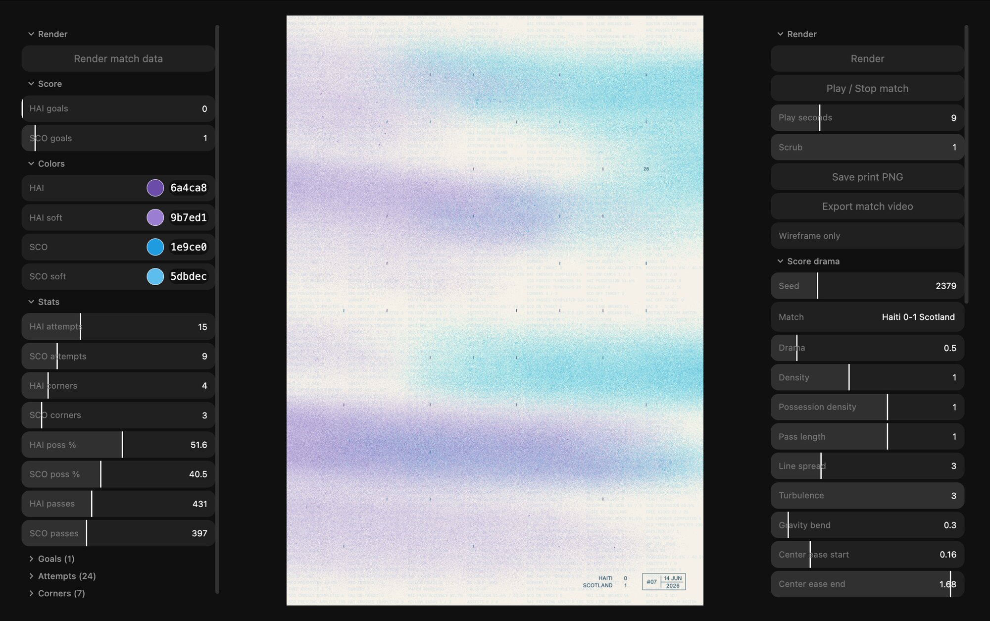
Generative art has this amazing quality where the final image looks spontaneous, but getting there usually involves a ridiculous amount of parameter tweaking. You move one number and ruin the whole thing. You move it back by 0.02 and suddenly it works again. So I built the interface below to iterate on the rules: on the left, the game data; on the right, the parameters controlling the composition.
The logic behind the poster
The backbone of the poster is a chrono-grid.
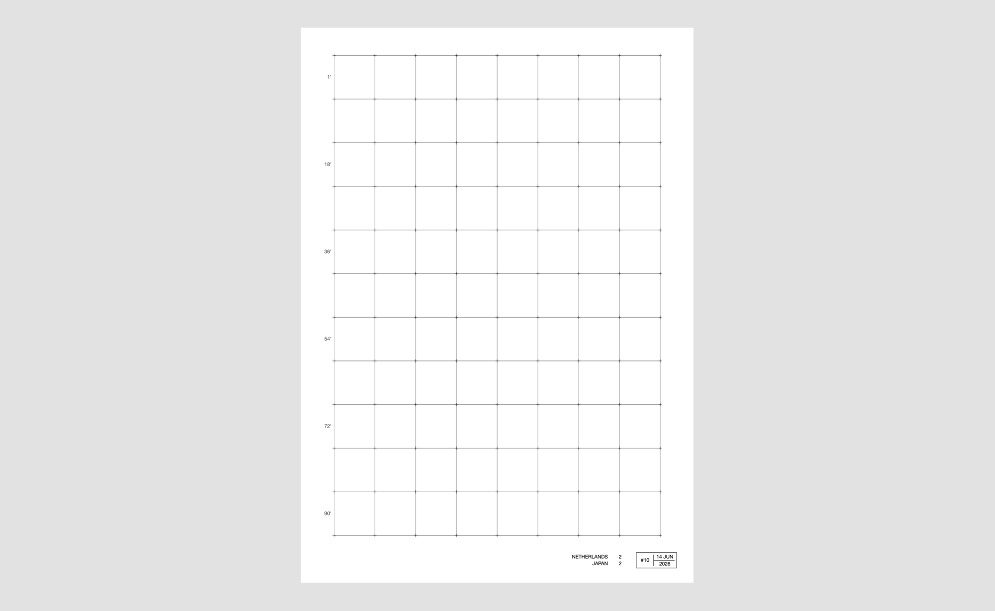
The full duration of the match is mapped onto a two-dimensional grid. The first cell is the kickoff. The last cell is the final whistle.
I landed on a fixed eight-column grid after trying a lot of different formats. Eight had the right balance. It gave me enough horizontal compression to make the two sides feel like they were facing each other.
The number of rows took even more trial and error. I started with something close to 200, which was completely unreasonable, and slowly tuned it down until I reached 11. That gave me roughly one minute per cell, which turned out to be a sweet spot.
The events
Once time is mapped into space, I can start placing events on top of it.
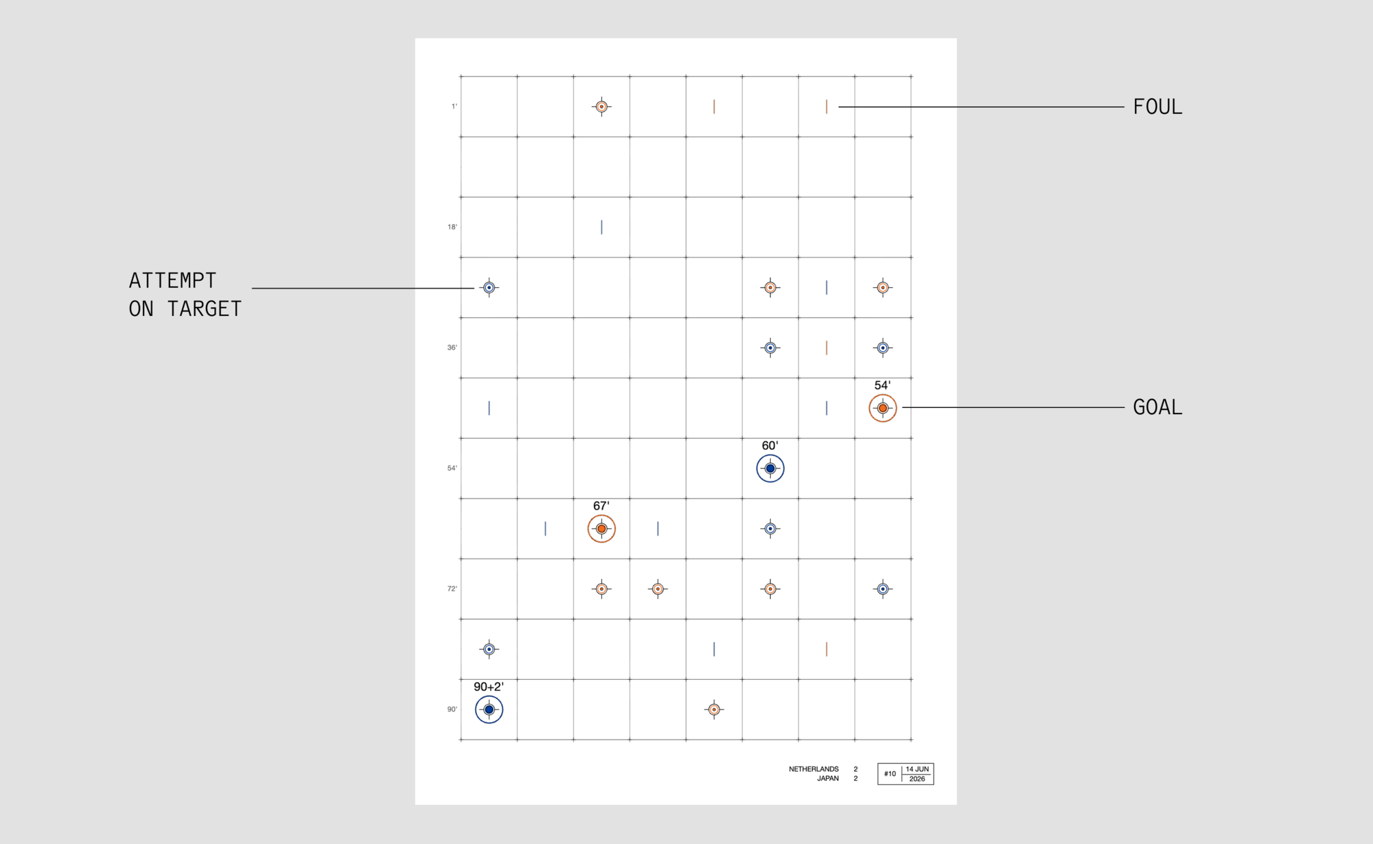
This year, I chose attempts as the central event in the composition. They felt like the clearest visual expression of attacking intent, a good proxy for pressure, ambition, and the constant effort to break through the opponent's defense. A match can have plenty of possession and still feel harmless.
On top of that, I also add fouls and goals. Goals are drawn larger and labeled with the minute they happened. Fouls are there too, smaller but still present. Each event is positioned in the grid according to the minute it happened.
The lines
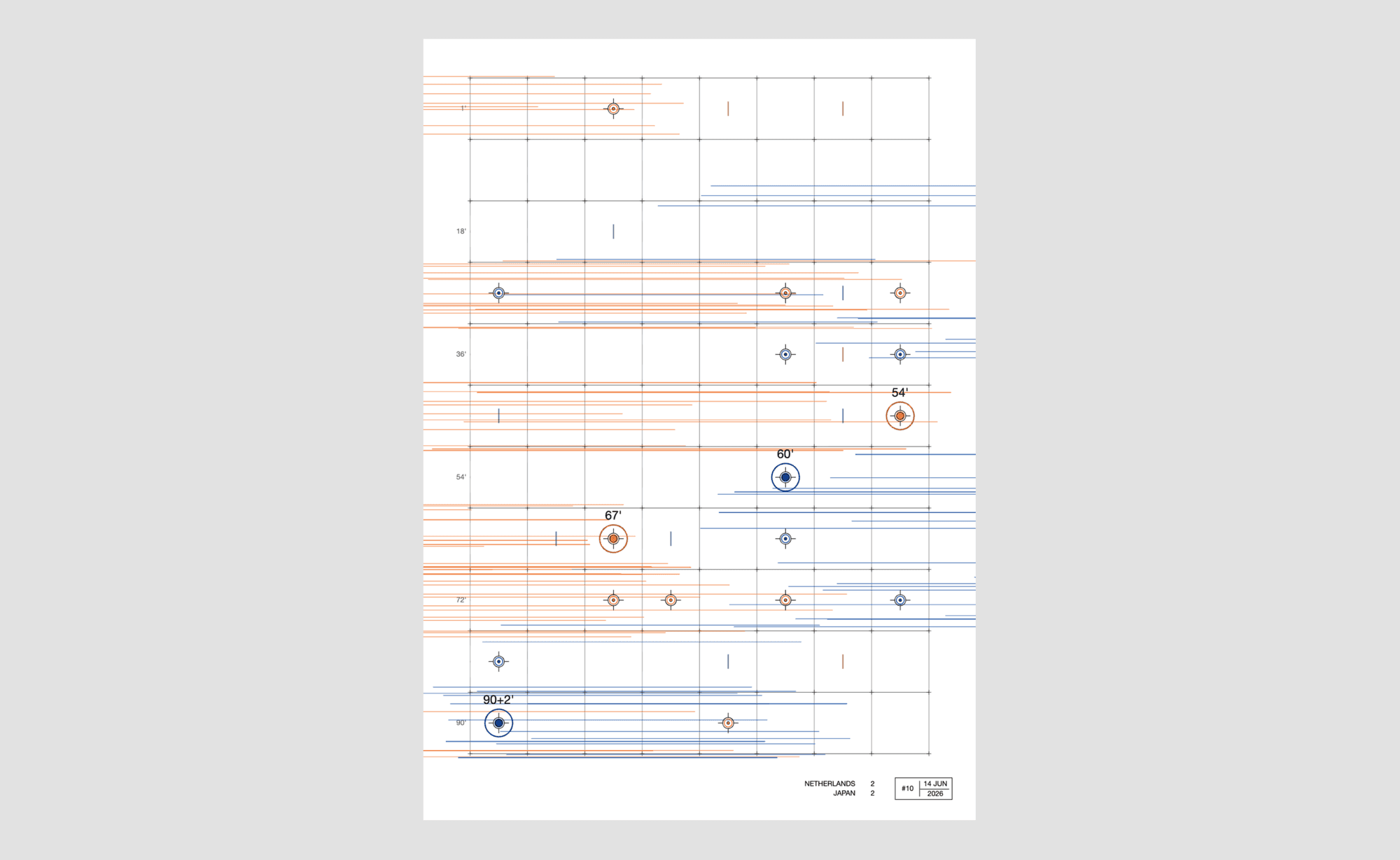
Every event emits a set of brush strokes. Home team strokes begin at the event and flow to the left. Away team strokes flow to the right. That directional logic gives the image its sense of confrontation, like two forces constantly leaning into each other.
The length of each stroke is based on pass share — that team's passes divided by the total passes in the match. The team that circulated the ball more gets longer strokes. A team with less passing volume gets shorter, more abrupt marks.
The density of the lines is driven by possession. A team with less of the ball appears sparser, while a team with more possession occupies more of the space.
The gravity field
If I just end with the lines the posters would look a lot alike. And here is the nice touch to create more variation between the matches:
Goals are treated as gravity points inside a vector field. This is a classic flow-field idea: place attractive or repulsive forces in space, and let nearby lines bend in response.
In practice, that means the strokes around a goal start curving toward it. The more activity there is in a part of the match, the more the surrounding flow gets pulled and distorted. Goals reorganize the space around them.
The drama
The final component is what I called score drama: a way to calculate how intense the game was.
Late goals, especially those after the 75th minute, carry the most weight. A penalty shootout adds a big jump. Close games, chaotic endings, and high-scoring matches all increase the drama score.
That score controls how busy the composition becomes. More drama means more strokes, more movement, and a stronger tangential force around the goals. Instead of lines pointing directly toward the goal, they begin to swirl around it.
This turned out to be important for two reasons:
- First, it gave more dramatic matches, especially knockout-stage ones, a distinct visual intensity.
- Second, it prevented all the lines from collapsing into dense stains around the gravity points.
The final aesthetic
With all the wires set, now it's time to make the composition have this brush look. For that I used the p5.brush² library — it's amazing how much you can customize in terms of pressure, size, spacing and material. The brush strokes are a custom spray brush rendered on a WebGL canvas. The typography is drawn separately, on an overlay above the image.
² p5.brush.js by Alejandro Campos Uribe — natural brushes, fills and flow fields for p5.js, built for high-resolution printing.The background carries all the data used to generate the poster, written repeatedly as texture. I liked the idea that the poster exposes the source material like an invisible hardware made visible. It showcases — and admits — that it was born from data.
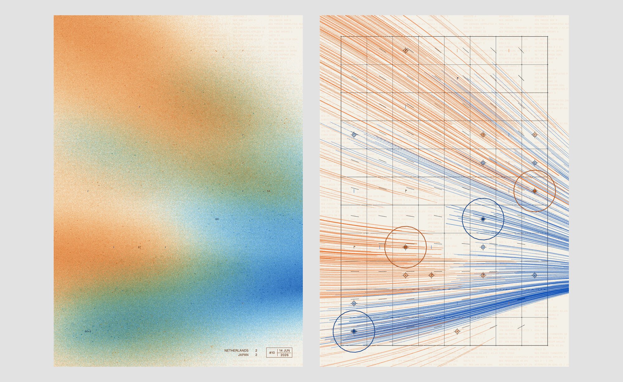
The colors are chosen by hand; the hard part is having to use just one color to represent a national team. I draw inspiration from flags, jerseys, and a sense of cultural association. For example, in Portugal, the red is closer to the green; in the Netherlands, it's clear that orange is the main color of the jerseys, even though the flag doesn't have it.
The posters
Looking across the set is when the project gets really satisfying.
Mexico has a noticeable dead zone: at the end of the game no more attempts on goal, and you can see the emptiness. France vs. Senegal moves in the opposite direction, with a burst of late goals that bends the whole composition into a diagonal.
That is the part I enjoy most: seeing how different matches leave different visual fingerprints.
The next step is printing them, so we can frame these amazing matches from the most watched sport competition in the world. So if you're interested in getting one, send me a message.
I'm excited to see where the series goes from here.
Enjoyed this post? Subscribe to get the next ones.